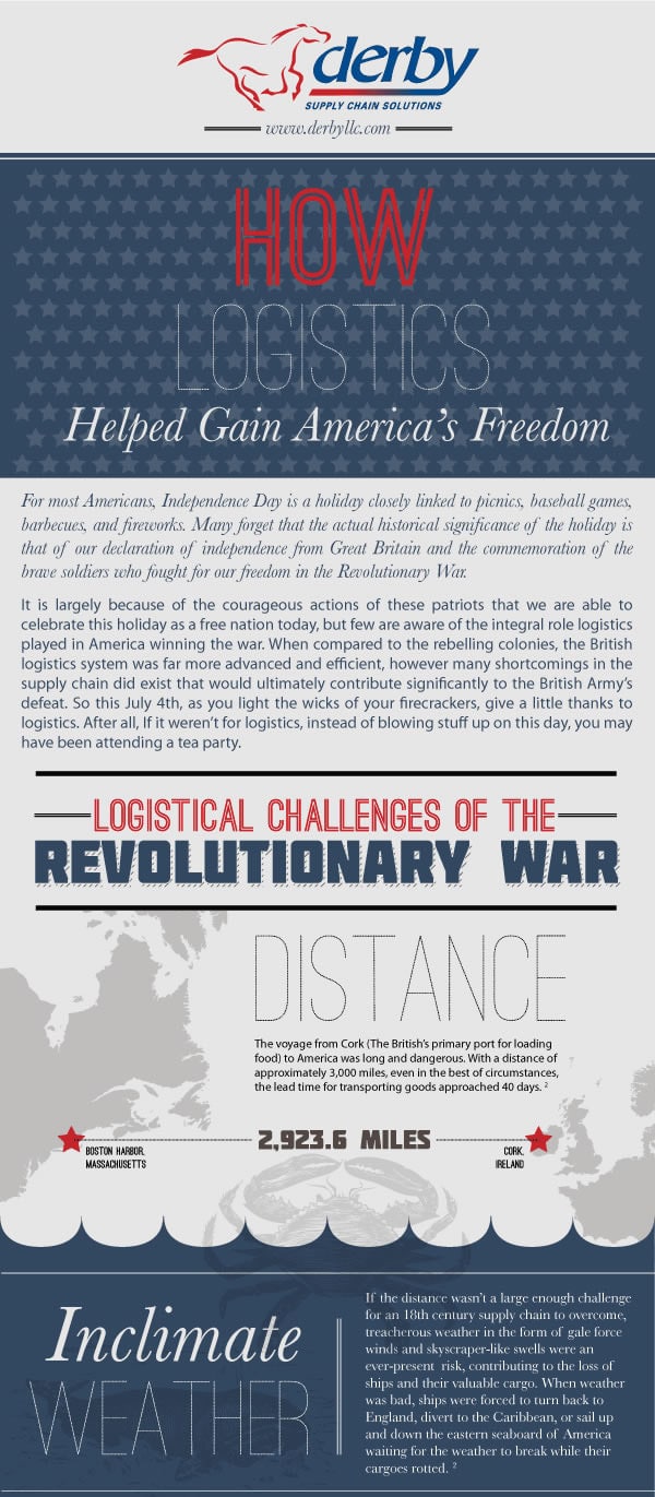
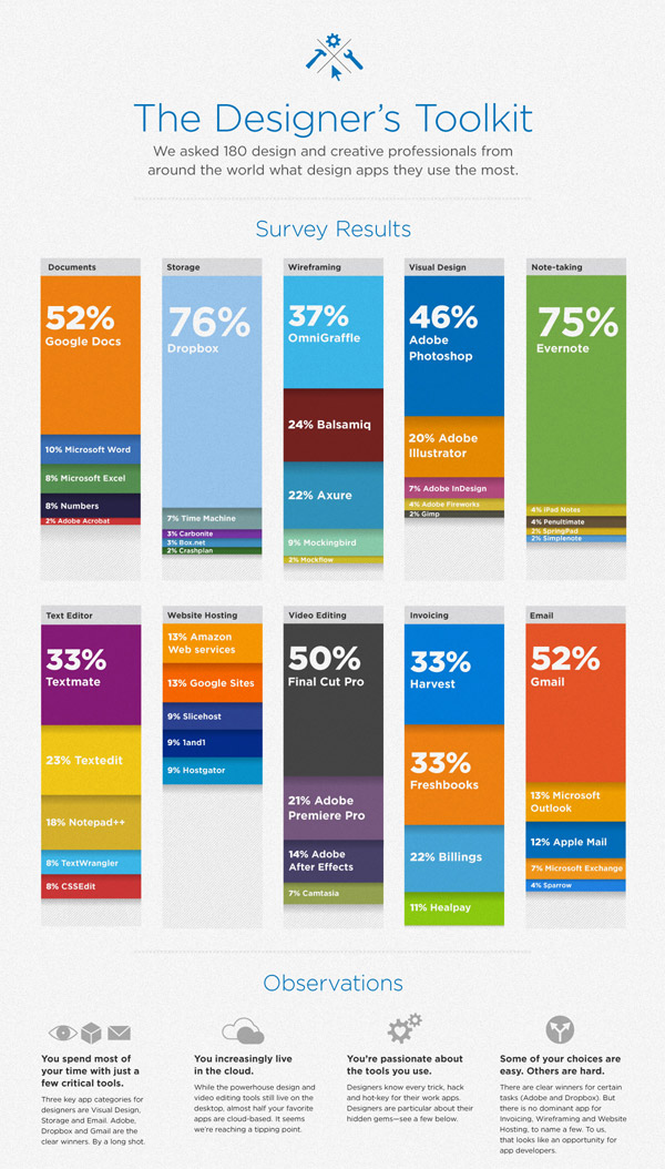
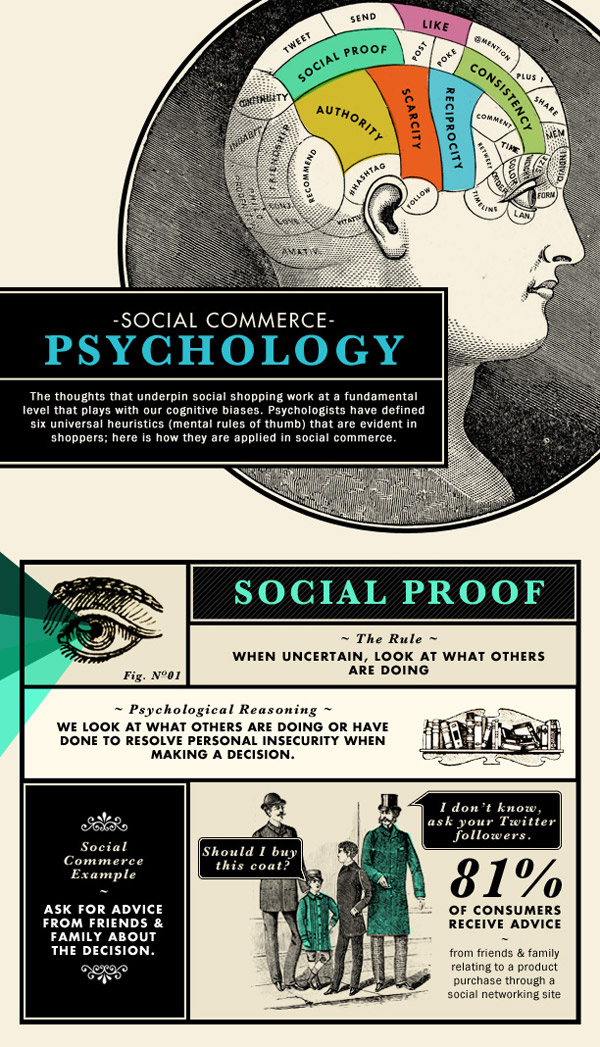
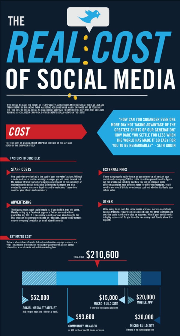
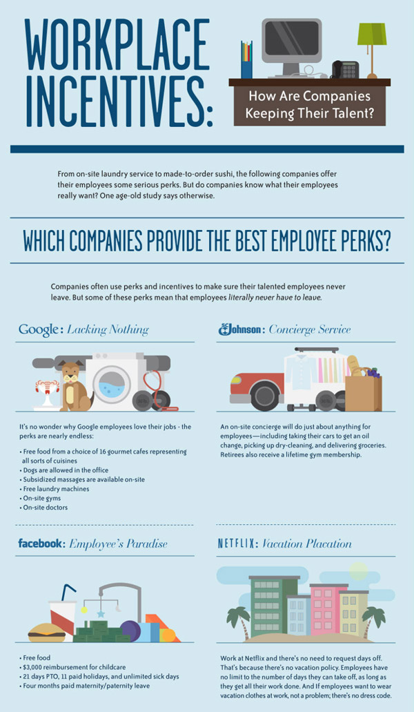
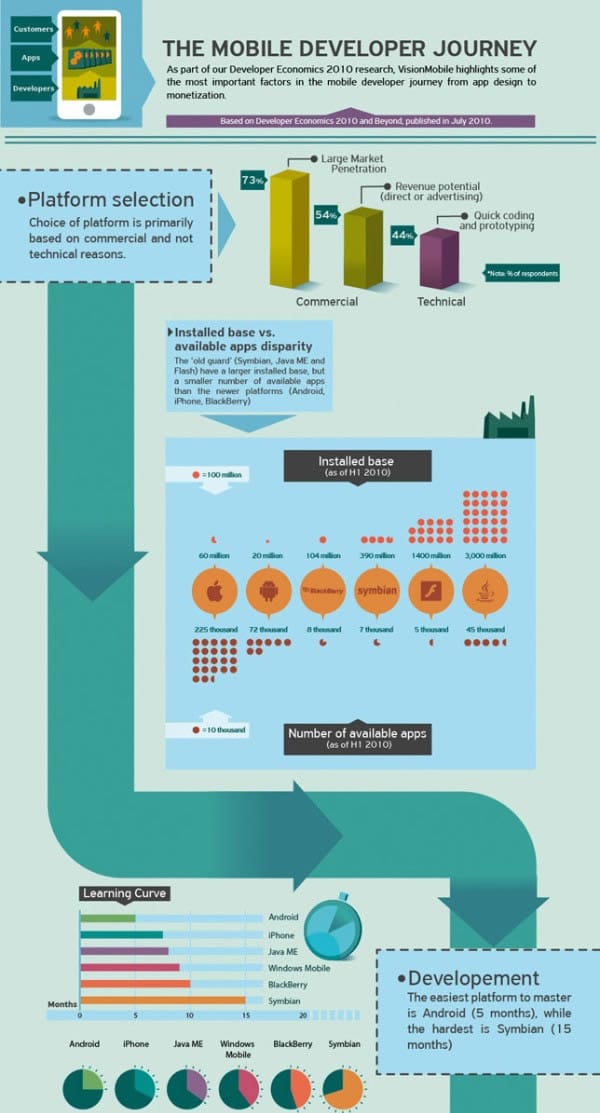
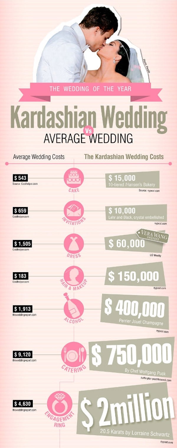
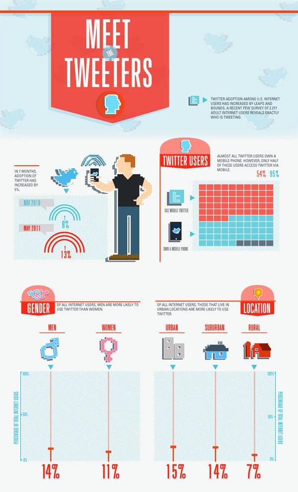
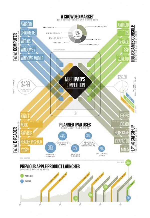
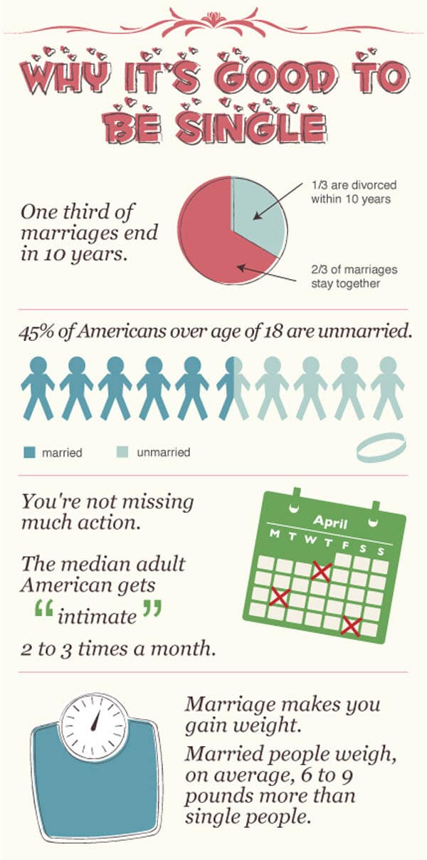
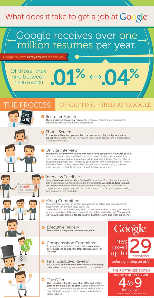
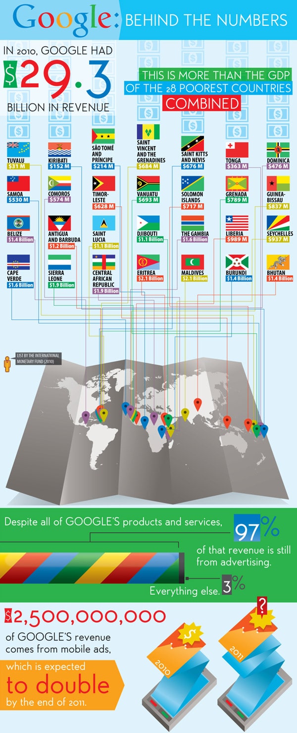
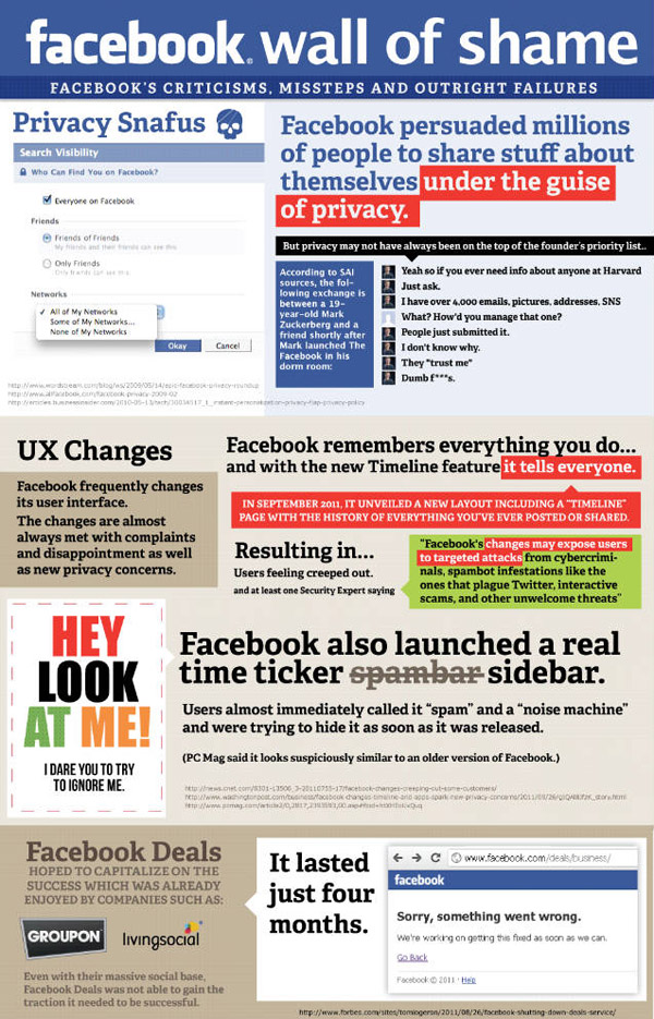
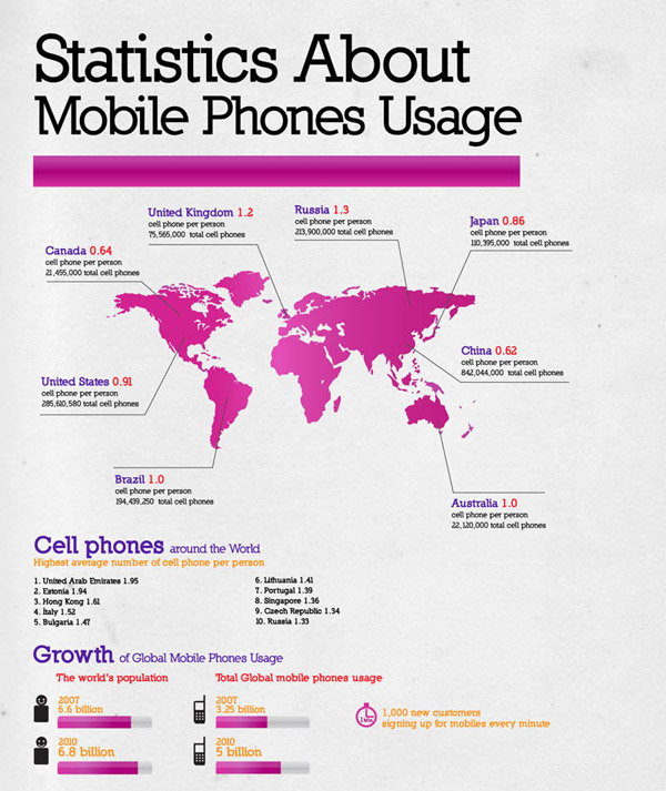
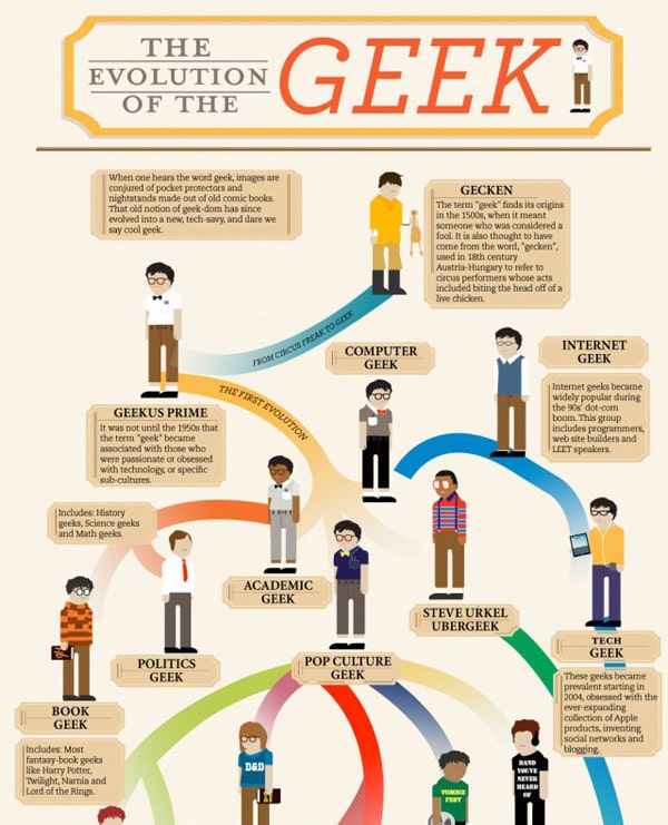
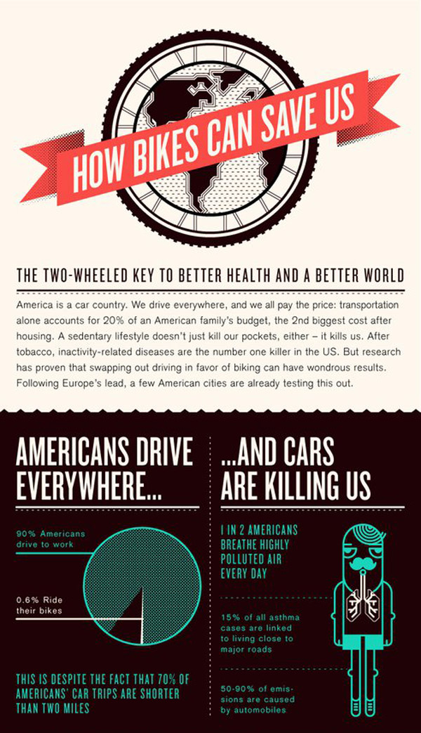
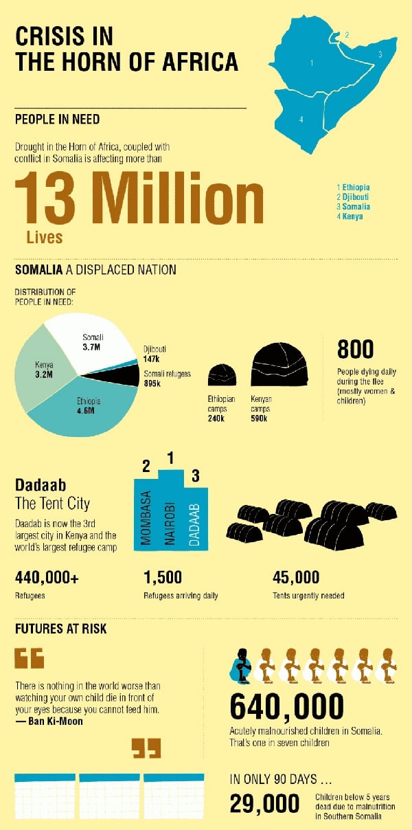
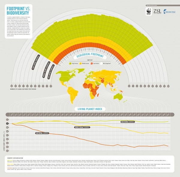
When most web designers are confronted with the infographic, the first thought that comes to mind is simply, “isn’t that just photo graphic creation?” While that thought does hold some truth to it, an infographic is much more than just an image. Originally created to jazz up boring information, such as scientific reports and maps, the infographic has evolved into an important means of communication that is increasing in popularity on most major content platforms.
[m2leep]
Unlike blog creation, which can come prepped with the best Joomla Templates or free WordPress Templates, infographics don’t exactly come with a ready-to-manipulate template. They must be created from the ground up by the designer. While there may not be a one stop shop for infographics, there are a few guidelines that every infographic must follow to be successful:
Data Must be Limited and Relevant
The beauty of the infographic is that it is able to tell a story or convey a message by predominately relying on images and icons. However, what makes an infographic stand out from a simple design is the integration of text. The text, or data, in an infographic is incredibly important because it has to convey what an image can not in few few words. Every word counts, and those shown should be important statistics, time frames and references needed to complete the overall message of the infographic.
Design Must Fit the Message and the Site
The design is actually the easiest part of the infographic for a designer. The design must obviously tell a story visually, and must be easy to follow – often directly the reader through the graphic through traffic inspired design. Most successful infographic designs contain highly relatable images and icons, as well as levels. As with any design, the type of font and the color used is important, and an overall scheme should be considered before even beginning the design process.
Knowledge Must Be Imparted
Both data and design should work together seamlessly to impart knowledge on the user. This forces designers to think not as just a designer, but also as a content writer. Because the written content within an infographic is very limited, each word counts and they must work together to give as thorough an explanation as possible. Together, the images and text must convey facts and deductions. So if you are creating an infographic about why America should go green, your images should be related to recycling, emissions, and environmental impact while your text should give the actual percentage of emissions, the number of plastic bottles thrown away each year, etc. The infographic as a whole would then allow readers to deduce that waste is bad, and that going green is the best way for us to live.
As internet users continue to desire the most engaging and efficient ways to consume information, the infographic will only continue to grow in popularity and function. Blogs will begin to replace articles with infographics, and writers will be replaced with graphic designers that are capable of telling stories with images and limited text. If you want to be able to increase your freelance revenue or are looking for ways to stay ahead of the competition, then becoming involved in infographic creation is definitely for you.
Great examples of well designed Infographics
New Years Resolutions
100 Million Professionals
Holiday Traveling in Europe
[adsense]
The Biggest iPhone Photo Infographic
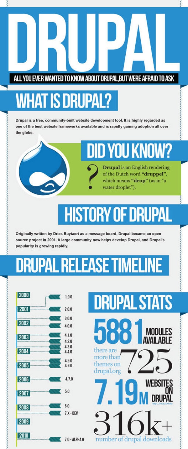
All you ever wanted to know about Drupal
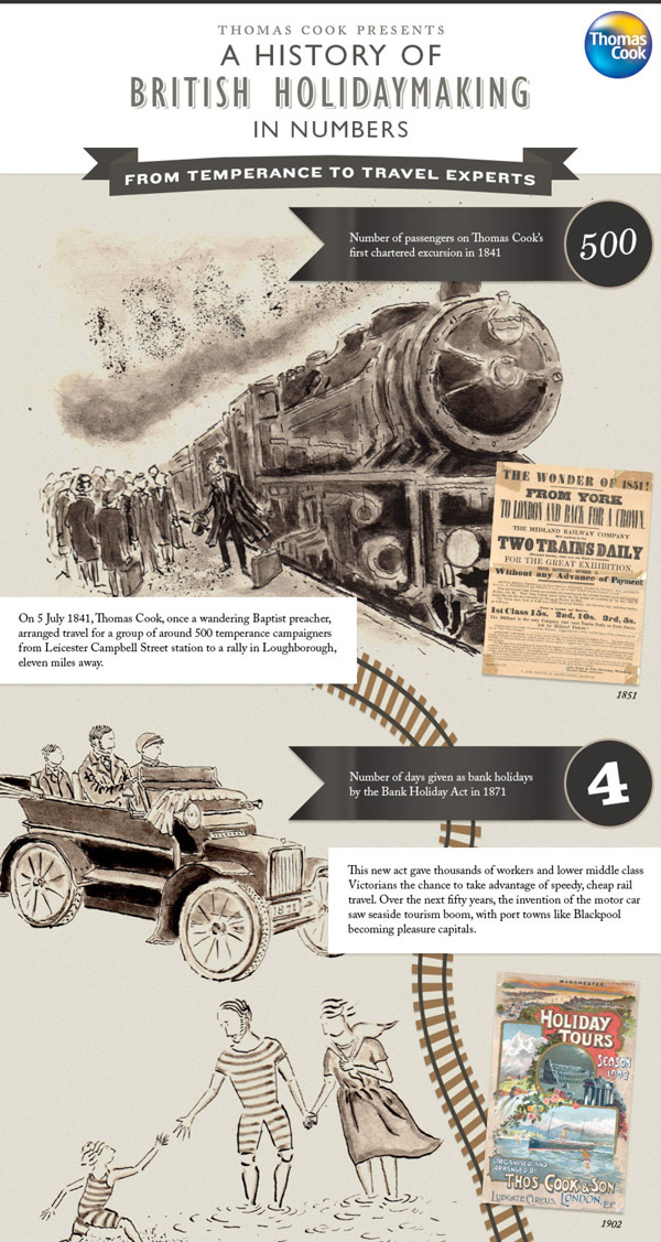
A History of British Holidaymaking
Effects of Google on Your Memory
[adsense]
You Are What You Tweet: 2011 in Review
How to Avoid Baking Emergencies
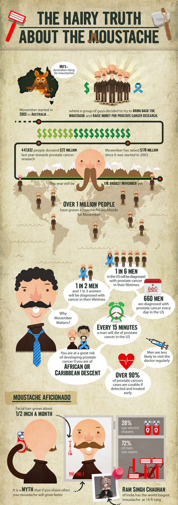
MOVEMBER
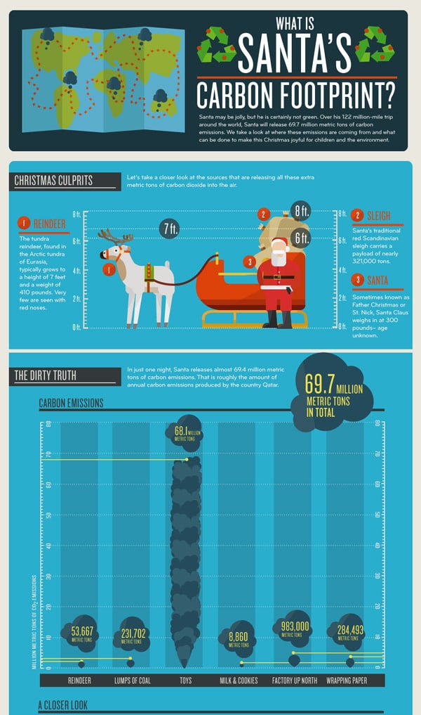
Santa’s Carbon Footprint
UK iPad usage survey
[adsense]


