When you think of WordPress, you probably think of blogs – which makes sense, as it is first and foremost a blogging platform and the most popular online. It is rare to come across an official or professional blog that isn’t hosted on WP these days, thanks to its heavy feature list and the free or low-cost options.
But did you know that other sites that aren’t blogs are also commonly powered by WordPress? In fact, you have probably come across dozens and not even known it.
Here are 10 amazing and creative websites that have been sneakily powered by WP, which are sure to inspire you:
[m2leep]
6Wunderkinder
Nice and simple, this website uses the space often utilized by a blog’s front page and uniquely presents its own version in the form of a professional website. Notice that it uses a grid template that you would expect for most modern company sites, but without giving up that stretch that makes it look so much larger.
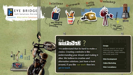
Eye Bridge
This fun designer’s site has a cool, custom layout that has a vintage look to much of the imagery. It has an old, broken-down motorcycle and a rotary phone from the earliest days of telephone technology. A closer inspection provides a lightly sketched cityscape in the background. Interestingly, it does have a traditional blog linked that uses the more classic look of WordPress.
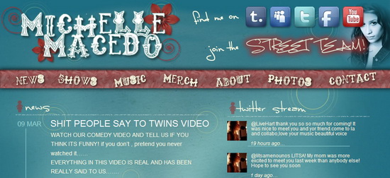
Michelle Macedo
Here we see how both a blog and a website layout can be melded together to form a single template. There is a series of bloglike updates going all the way down the page, but with a header and top page that looks more like what you would see on an official artist’s website. You can even see an “Older Posts” button on the bottom.
Racket
Australia-based design company Racket is award winning for a reason. It will become very clear the moment you go onto its website and see how it created a ridiculously cool (and weird) homepage. The imagery is surreal and senseless, though managing to retain something in the tone that immediately reminds you of its country of origin. Like Eye Bridge, it has a blog that is more standard and linked through the “Ranting” header at the top.
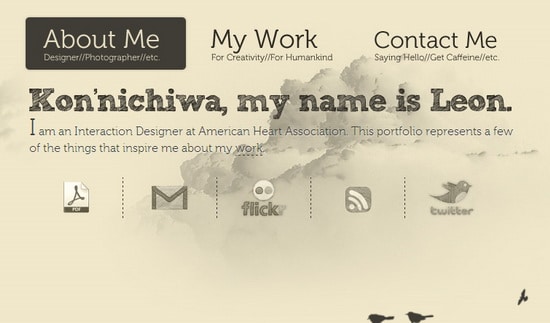
Who Is Leon
Proving that WordPress really does allow for completely customized content, this designer has made something truly unique. Done entirely in shades of gray that appear to have been sketched with a pencil, the background has a series of slowly drifting clouds that move across the screen. All other imagery is minimal, with a couple of birds and electrical wires. This is definitely one of the better WP-powered websites around.
Van Coke Kartel
Somehow this band managed to create a seriously complex looking website with a clean and retro design. Based mostly on a moveable slideshow to get to a new portion of the site, there are also headers and footers that give primary links to content. The blog is located behind the DFTWR link. But even that is a lot more heavily designed than most.
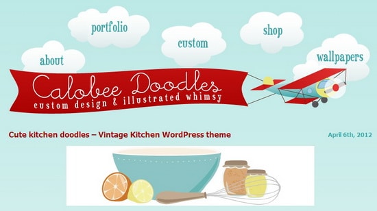
Calobee Doodles
The website of a children’s artist, this portfolio has a definite childish and whimsical feel. It still uses a blog format of sorts, with a button to let you see older entries. But there is something about the way the header is made and how there is only a single “post” per page that looks like a more traditional layout.
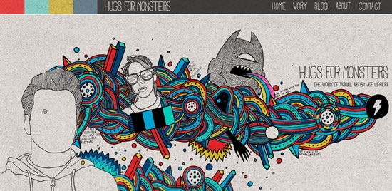
Hugs for Monsters
Just the site name of this portfolio for designer Joe Lifrieri is pretty unusual. But the layout is even more so. It has a drawn image of a mass of colored patterns with pictures coming out of it, such as a rainbow-vomiting monster and a one-eyed representation of himself. He has a full work section but the front page is a small selection of his past projects. There is also a blog that uses a really excellent template that is worth looking at.
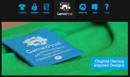
GamerPrint
This site still looks a bit like a blog in the way it is set up, with the block look to recent news. The layout is pretty cluttered and busy, which is a rare thing with professional sites these days. Most are going for clean templates and minimalist trends. But it is still set up in a way that is easy to read and navigate and reminds me a bit of a teen design, which is its target demographic.
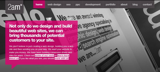
2am Media
A really cool idea, this design is unlike others I have seen. It manages to use a grid template that is truly unique. Everything is laid out right there, set up so you can reach any content from a single front-page link. The blog is exactly the same way, with the same surprising color scheme and setup.
Conclusion
These are all sorts of creative uses for WordPress that aren’t the usual blog templates. Real, solid websites can take advantage of this platform, including its many features that allow even the technologically challenged to easily customize it to their desired layout.
Check them out and let us know your favorite nonblog, WordPress-powered websites in the comments.

