Data visualization is becoming more important as metrics are needed for everything from customer conversions to the current bounce rate. Data visualization allows for data to be organized in an easier to understand format. The wide variety of graphs and charting styles allows for any problem to be solved and any kind of data to be charted. Choosing the wrong kind of chart for the data you have available can also cause confusion on what you are trying to communicate with the presented data.
Since this data is often used in decision-making it is important to choose the right chart type for visualization so that wrong decisions aren’t made based on bad interpretation of the data. Bar charts are used for representing categorical comparisons or for trending data over time. These simple charts allow for an instant understanding of changes over time in a specific category.
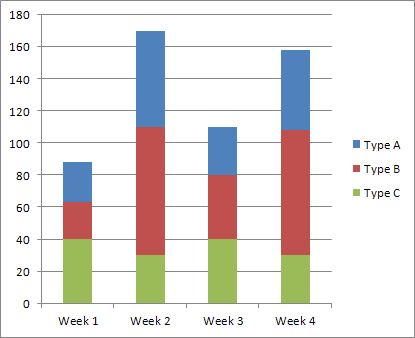
In contrast, stacked bars allow you so view several data sets to be stacked on top of each other, each whole bar represent a certain volume. They show how a complete category is broken up into segments and the relationship these individual segments have on the total whole or amount.
For example, if you wanted to chart the population of students in each of the three seventh grade classrooms in a school and wanted to further break down the classes by gender, three bars would stand next to each other, while each individual bar would be broken into two segments – one for girls and one for boys – within the individual bar.
Thus, every bar would represent the entire class population and each segment within the bar would represent amount of boys vs girls are in the class. Creating effective stacked bar charts can be a little confusing, but when well executed they allow you to clearly visualize comparison and trending. Using clear chart design principles can help you created an effective stacked bar charts that are cognitively friendly and allow for the max amount of view comprehension.
To help in the mission to build an effective chart we’ve collected and rated the best examples of stacked bar charts.
How We Chose Our Ratings
We chose our examples based on clarity of instruction, ability to comprehend the information, how easy it would be for a novice to take the information and build a stacked chart, and authority of the site on which the example is found.
Honesty, accuracy and authenticity are important to us. Because of this, we make sure to vet the sources of our information thoroughly so that you don’t have to. We’ve looked at the comments and reactions of those who have used the examples to make their own charts to make sure the information is viewer friendly.
Data visualization is dependent on good graph design, including compiling information in a form that is can be easily read and understood while being completely accurate. We’ve chosen the examples with these in mind.
Top Ten Best Examples of Stacked Bar Charts 2022
Here is a list of articles from both blogs and websites that address how to create your own stacked bar charts.
1. Understanding Stacked Bars: The Worst Or The Best?
Vitaly Radionov, the data visualization expert at AnyChart, writes an extremely thorough break down of everything stacked bar charts in a friendly, approachable way on this Smashing Magazine article.
Radionov defines the stacked bar chart then discusses its best uses. He even gives his opinion on the use of stacked charts. He takes the time to give examples of stacked bar charts and explaining each one.
Each new chart grows in complexity so by the time you finish scrolling through them you understand the charts from their simplest iterations to their most complex. A thoroughly informative and entertaining read.
Overall Rating: 5 out of 5
2. What To Consider When Creating Stacked Column Charts
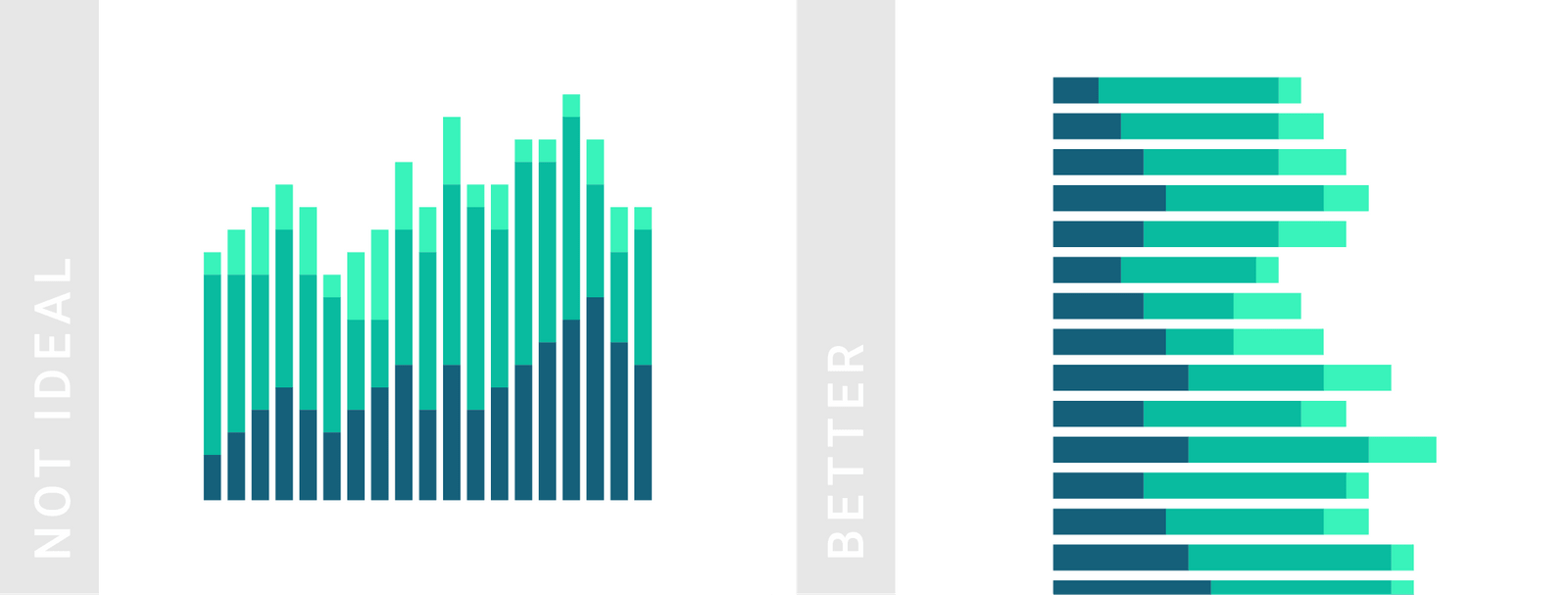
Offering a more focused article on the Datawrapper blog, Lisa Charlotte Rost, web designer and data vis writer at Datawrapper, offers advice on what to consider when creating a stacked bar chart. After each paragraph of advice, she offers an example of an ineffective stacked bar chart containing the error she has discussed and then offering an example with a better version of that chart.
She does this for the length of the article pointing out pitfalls when creating a stacked bar chart. At the end of the article, she presents the ideal stacked bar chart, incorporating all the tips she had discussed. The only downside is that it speaks specifically on stacked column charts. There is often not much of a difference between them, however. For it’s concise and immediately applicable advice:
Overall Rating: 4.5 out of 5
3. Use Cases For Stacked Bars
In this article from Storytelling with Data, Cole Nussbaumer Knaflic takes input from his readers to mine out the cases in which stacked bar charts are both useful and necessary. Letting his readers take the lead, the article presents several examples of stacked bar charts used in different scenarios creating case studies around each one.
The examples themselves can get a bit confusing to understand, but they get major points for sheer volume and variety. For insightful case scenarios and reader involvement this article gets a good rating.
Overall Rating: 4.1 out of 5
4. Using Stacked Bar Charts To Visualize Survey Data
Tab gives a refreshing look at stacked bar graphs and explaining outright how to create a straight-forward, viewer-friendly graph. It doesn’t offer many examples of bar charts like the sites mentioned above, but it does give you tips on how to create the most brain-friendly and clear stacked bar chart you can.
It offers advice on color choices, text density, and the amount of information you can realistically build into the chart. It would be wise to give this article a quick read before sitting down to create your chart.
Overall Rating: 3.9 out of 5
5. Understanding The Shortcomings Of Stacked Column Charts
This informIT article gets very real on why you should consider carefully your reason for using a stacked column chart. Much like the other articles presenting examples of when and when not to use a stacked bar chart, the article offers specific cases in which the stacked bar graph is useful and when it isn’t.
After this, it gives you various examples of effective stacked bar graphs from an expert in data visualization. It gives you clear steps in your creation of a stack bar chart and what information you can extract from the charts.
Overall Rating: 3.8 out of 5
6. Stacked Bar Graph
The Data Visualisation Catalouge splits the explanation of the stacked bar chart into two portions – description and anatomy. In the description portion, they explain the uses for the stacked bar chart and warn against the pitfall of breaking an individual bar into too many segments. Data overload is one of the quickest ways to cripple the readability of your chart.
In the anatomy portion it shows you two examples of the stacked bar chart – a simple stacked bar chart and a 100% stacked bar graph. This article is efficiently telling you what you need to know. No more and no less. For a more thorough overview it’s best to visit one of the sites higher up on the list.
Overall Rating: 3.6 out of 5
7. When To Use A Bar Chart Stacked
The article on Chartblocks is a great start for a novice graph creator to get started. It shows you one detailed chart and a succinct explanation of what a stacked bar chart is and what it is used for without being overwhelming.
It gives an example situation for which the chart should be used which compliments the graph nicely. For a quick snapshot of what a stacked bar chart is this is a good place to start.
Overall Rating: 3.5 out of 5
8. Stacked Column Charts
The article from the popular website Exceljet keeps to its promise of being short and to the point. Giving a quick explanation of why it’s best to use in stacked column charts in some situations and then taking us through a list of pros and cons, this article comes up a little short in the information department.
It might not help someone who is just starting out in their visual visualization journey. But while is comes up short in the text content area it does offer a few great examples of what a stacked bar chart should look like, whether it is a 100%-based chart or non-100% based chart.
Overall Rating: 3.2 out of 5
9. How Do I Create A Stacked Bar Graph?
Already have a standard bar chart that you want to convert? This article shows you a quick way to convert already existing bar graphs into stacked bar graphs using Piktochart or another graphing tool.
Though not offering much in way of actual content it serves as a reminder to use charting technologies which can make chart creation easier and more productive. It also offers an example of how to use a graphing tool to create a stacked bar chart.
Overall Rating: 2.9 out of 5
Buyer’s Guide
Creating data charts can be a time-consuming endeavor. To save on time and increase productivity you should consider using a data visualization tool. Let’s look at some of the most popular data visualization tools you can use to create your stacked bar graph and how to choose the one that suits your needs.
Datawrapper
Making an appearance in our list of best examples, Datawrapper is quickly growing in popularity. Media organizations appreciate the simplicity of its interface and the ability to easily upload csv data and create straightforward charts. These charts can then be embedded into reports with ease.
FusionCharts
This widely used data visualization tool became popular because of its extreme flexibility. The flexibility springs from its ability to integrate with many different platforms and create over 90 types of different charts. One of its most popular features is the option to the user of being able to choose from one of its “live” templates rather than starting one from scratch.
Highcharts
With a claim to fame that it is used by most of the top 100 companies in the world, Highscharts requires minimum training in specialization in data visualization. This allows for a quick roll out and implementation of the program. The crux of its success has been the company focus on cross-browser support, which means anyone can view and run its visualizations. This tool does require a license for commercial use.
Tableau
Suited for dealing with large and fast-changing datasets, Tableau is the master in the data visualization industry. Tableau has gone to an extensive amount of testing and is a result of tons of research. This research has gone into developing the tool to the point that it can take big data, such as that used in artificial intelligence and machine learning, into a visualization easily read by human eyes.
Qlikview
Tableau’s biggest competitor, this tool has a high-learning curve. It requires time to grasp its highly customizable setup and high feature range. Though this is its strongest draw, it might not suitable to those without the patience or the training to take advantage of its advanced features.
When choosing a tool to create your stacked bar graphs you need to keep in mind the training you have, the technical resources you have, and the shape your data is in.
Whether using a program or doing it all on your own use this guide is to see the best examples of stacked graph charts.


