We are influenced by the cultural norms we live in. A company failing to create a logo which reflects the social attributes of its target audience, may suffer considerably. It is observed that logos which are designed keeping in mind the cultural and other characteristics of their target audiences become evergreen logos and ultimately attain global recognition.
[m2leep]
In order to design a successful logo which immediately strikes your perspective audience, do your research thoroughly. Get to know how they think, act and lead their lives. What inspires them and what pushes them away. Only then, you will be able to craft a logo which talks to them rather than make a simple impression.
Let’s take a look at some of the cultural and geographical influences which can help you in designing a successful logo for your brand.
1. Colors Reflecting Cultures and Events
Colors have a different meaning in every culture. While white is considered to be a symbol of purity for Muslims, it is the color of death in the Chinese culture. Chinese hold yellow to be sacred which surprisingly denotes sadness in Greece and associated with jealousy in France. In the American culture, red induces a feeling of energy and excitement and black may be reflected as powerful, elegant and sophisticated. No wonder many powerful and famous brand logos are either red or black.
Colors Representing Innovation: The Google Logo
The Google logo looks quite modest with elegant colors devoid of any flashy fonts or symbols. But don’t take its simplicity for granted. These simple colors have a profoun
Colors Representing an Event: KFC as an Example
Sometimes, colors play as instruments to connect an existing brand logo to any major upcoming event. For instance, recently KFC changed their trademark red and white logo to Australian colors in Australia.
This was done so to support the Australian Cricket Team against England in the Ashes Series. Being a major sponsor of the event, KFC creatively used respective colors to give a new feel to their logo by establishing a more personal connection with their customers.
2. Hidden Symbols Symbolizing Geographical Features
Every geographical region has a specific emotion or characteristic attached to it. Many famous logos have incorporated these elements leaving an impressive mark on the design industry. Not only such logos click instantly with their respective audiences, they carry a universal appeal due to their creativity. Look at these examples where innovation is at its best.
Yoga Australia
The negative space between the lady’s arms and legs creates a shape similar to that of the map of Australia.
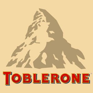
Toblerone
The logo of Toblerone displays a hidden bear which is the symbol of Berne, Switzerland: the place where the chocolate originated from. The bear is hidden in the MatterhornMountain of the country. This makes the logo interesting not only for the people living in Switzerland but for the overall global audience which appreciate the creativity expressed in this logo.
Museum of London

The year was 2010, when the Museum of London decided to revamp its look, for the purpose of establishing a newer outlook and to appeal to a younger audience. The re-invented logo they offered was certainly fresh exuding creativity and much to our delight contains a geographical message. One can learn a great deal about the history of London just by glancing at it. The logo represents a number of colored layers, each displaying a different geographical shape London had taken during its evolution in various eras of time. This mirrors the past and current changes that the museum exhibits and documents inside. Due to its vibrant colors, the logo instantly grasps attention of everyone.
3. Successful Logos speak the language of their clients
Does the Apple logo show any laptop or a phone? Do you know the actual meaning behind Sony Vaio’s logo? A logo mirrors what your client is all about. No need to design an artsy logo which fails at communicating what you actually offer to your perspective clients.
For an ordinary man Sony Vaio’s logo is nothing but a flamboyant way of printing the name. But in reality, the initial two letters are a depiction of an analog signal whereas the “I” and “O” represent the 1 and 0 of the digital word. This is innovation at its best. The logo mixes technology and creativity to gel together and the result we get is pure genius.
Even if you didn’t read the words underneath the picture, you would still know that the logo’s attached to a company known for resolving your electric problems.
Your logo speaks best when it says exactly what you do and how you do it. No need for any irrelevant object or representation for the sake of designing a logo. Rather, you should incorporate your strength or the core message of your logo so that it cannot resonate with your audience. Such a logo which reflects cultural and social norm while adding a bit of innovation remain long –lasting and have a deeper and longer effect on consumers.
Conclusion
The right logo clarifies the brand’s message which is instantly interpreted by its target audience. If you get an irrelevant logo designed for you brand, not only it will harm your future growth it will also tarnish your brand image and your respective audience will find a hard time to connect to your brand. A logo is not just a representation of a brand’s culture. To fully serve its purpose, the logo image must spell out what the company does as well as be able to resonate with the social, cultural and geographical features of the targeted region.


