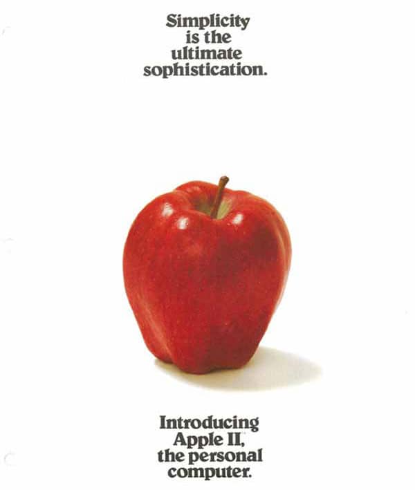
Steve Jobs, the late progenitor of Apple Computers, a visionary and a true design aficionado loved simple design. He once told Sir Walter Isacsson, the author of his autobiography, “I love it when you can bring really great design and simple capability to something that doesn’t cost much,”. The guiding tenet of Apple’s design aesthetic was simplicity-“It takes a lot of hard work,” Jobs said, “to make something simple, to truly understand the underlying challenges and come up with elegant solutions.” This philosophy is deeply ingrained in Apple’s DNA, as indicated by the headline of its first marketing brochure in 1977 which read, “Simplicity is the ultimate sophistication.” More often than not, you will probably hear people cite Apple as the leading example of why simple design is good. But, what is so special about simplicity in design?
There is hardly anything as good design or bad design. Something that looks good to you might be not so good for other people. Design is, more than anything, a subjective topic. However, you need to identify good design elements and accept the fact that everyone will have different tastes and thus, a differing opinion. If you’re done studying about how to create a website from scratch, this article will be a great additional guide for building your very first portal.”
Why Simple design?
Simple design has certain advantages over the more complicated ones. They are easier to understand, cheaper to make, and easier to fix in case there is a need to. By keeping it short and simple, you ensure that your audience isn’t unnecessarily overwhelmed and distracted from the message that you intend to convey. Sometimes, your designs are just complicated because it’s a product of your understanding and not something which your customers would love. The moment you stop selling through your designs, your audience will stop relating with you.
What’s so special about the design strategy of Google? Why does the Internet giant, one which has the best brains of the planet working for it, has been sticking to the simplest home page that a website can ever have? Because, that’s what explains in whole what Google is all about. The moment you have to explain your design to others, the entire fun of creating that design, no matter how special it might seem to you, is lost. Jobs once said, “The main thing in our design is that we have to make things intuitively obvious,”.
The basic motivation behind creating a design that is different from others is to reinforce your brand value in the consumer’s memory. With a good brand value you get the power to sell. If your product fails to sell, even an award-winning design won’t get you anything.
Simplifying things basically means you can reach a broader spectrum of audience. But there is more to it. Simplifying also means you are amplifying the meaning being conveyed. How? Because, the audience then uses its imagination to bridge in the gaps with their own views and backgrounds. The audience is forced to see beyond the realms of superficial and absorb the real meaning.
Science proves the same.
A study conducted by none other than Google in 2012 reflected a common sentiment amongst those surveyed. Most users take only 1/50th to 1/20th of a second to judge a website’s attractiveness. Besides, most visually complex websites are consistently rated as less beautiful than simple websites.
Sites which feature prototypical design were rated as the most beautiful amongst all the options. Now what exactly is a prototypical website?
According to a definition, prototype is an early sample, model or release of a product built to test a concept or process or design. Prototypicality is the basic mental image created by a human to categorize everything you interact with. Whether it is a car or a watch or a mobile or your website, your brain has created a model for how things should appear and feel. Thus, by keeping your designs simple, you are conforming to the popular mental image. This increases the chances of your design getting accepted by the masses. For example, a social media website has a certain prototype which one must keep in mind while designing their own version of it.
Another scientific concept that favors simple design is cognitive fluency. When it comes to decision making, people are affected by how easy or difficult it is to think about something. Unsurprisingly, people prefer things that are easy to think about rather than difficult. This feeling of ease or difficult is called cognitive fluency. Ease of pronunciation is one aspect of cognitive fluency. Similarly complexity of design can also be related with cognitive fluency. If your target audience grows familiar with certain design characteristics, deviating from it might make your website appear less beautiful or appeasing to the visitors.
A joint research done by Harvard, University of Maryland and University of Colorado found that the more visually complex a design was, the lower was its recall value. The reason isn’t hard to guess. Less visually complex websites or simple designed websites , in other words, require less ocular and mental efforts to decode, process and store information. The more visually diverse a design is, the greater work eyes have to do to send the information to the brain. This is going to tire out the human brain faster. You don’t want a visitor to get tired of your website, do you?
If your audience cannot relate your website’s design to something familiar or a previous experience, they might just end up wondering that things are not where they are supposed to be. This is not good for your site’s business. This is why; simple design is considered the best design. Maintaining simplicity isn’t a cakewalk as humans have this tendency to deviate towards complexity. However, with consistent practice and due attention to customer feedback, one can keep their design principles and aesthetics simple.