There are plenty of typographic posters that can be seen anywhere, from movie theater lobbies to outside of clubs. Then you have typography on album covers or in logos and, of course, in web design. But there are other items using the same method of font art that are less celebrated and so are largely ignored.
One that doesn’t get nearly enough exposure is typographic calendar art. Using this type of graphic, many designers have created truly unique and interesting wall decorations that serve a specific purpose while just plain looking good.
Here are 10 gorgeous examples of how typography can be used in modern calendar design, even if it is only because of the font that is being used.
[m2leep]
Seasons Calendar


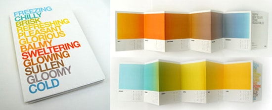
Many people have seen this amazing calendar since its release in 2008. It is the perfect example of how creativity can be applied to the showing of dates and the passing of time. The idea is to use color and descriptive words to show the changing seasons from one end of the year to the next.
Each one melds into the next to express the more subtle shifts in weather and temperature, with adjectives such as “gloomy” and “balmy” to press the point on the cover. Otherwise, there is a general calendar format beneath the colors.
Table of Days

The period table is an immediately recognizable object that lists everything clearly and with great organization. Most of us learned the elements of that table by heart in our grade school years as part of our science education.
This calendar uses the same format to show the entire year. It even has the months grouped by the same color scheme. The font used is Helvetica, which makes for a perfect print look.
Apple a Day

Want to try to eat more healthily? We all do. This calendar helps you to do that while keeping track of the passing of days. You basically take the sticker off of each apple you eat once a day, and put it on the calendar. What a great way to increase your fruit intake and show your progress as you go along. Plus, it is an easy calendar to make yourself.
Flipbook Calendar


Flipbooks aren’t seen very often anymore. But they used to be a staple of activity for any standard child, who would make their own in the corner of their schoolbooks to pass the time.
This uses the same process through the calendar, which goes day by day to allow for schedule organization. In the center of the opposite page is a tree, which changes color and eventually loses its leaves as it moves into winter.
Spiral Poster

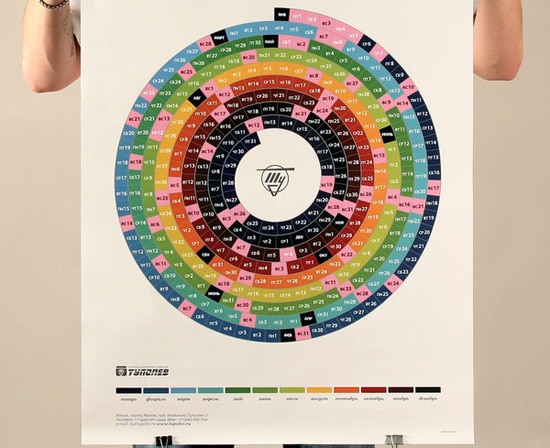
Poster calendars are becoming pretty popular lately. This one uses a colorful spiral with each month spread out into days. The final effect is similar to a seashell in construction, with different-size layers making up the image.
Cardboard Book

Using a very tactile-specific cardboard cover, this has a woodsy look to it that is pretty nice. The top is tied together with a thick twine, though you could use a strip of leather or something similar to the same effect. I think this would make a really nice gift idea if you wanted something DIY.
Block Letters

This calendar has a nice touch for typography lovers. It uses all block letters to make up the dates, with different days written with brightly colored capitals.
The letters are against a black background, which makes them pop, and there is a retro feel to the whole design. Each month has one line of days, with smaller letters against the larger ones and a row of numbers on the top to make a graph.
Typography Specific

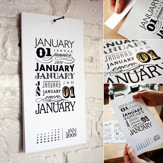
This one is all about the font. Notice the way it has been broken down into two parts, with the display at the top and the dates on the bottom, just like traditional calendars.
But instead of a picture, it repeatedly features the month’s name and abbreviation in a set of various typefaces. It even incorporates the number equivalent amongst the lettering.
Random Words

If you like something somewhat random and bizarre, this will be a perfect addition to your home. Rather than write something that has to do with the month, the designers created a set of random sentences that don’t mean much of anything.
The only relation is that the name of the month has been put into the lettering in a different color. For example, “Mars Is Made of Chips” spells out March when you take the “mar” and the “ch.” Probably the most impressive use is, “Let’s Separate the Teddy Bears From the Amber,” for September. Wow.
Experimental Book

This one is a little out there. They basically took a book calendar format and used it for an experimental typography design that is all over the place. It sort of looks like the dates are hanging down to the edge of the page, which is cool.
But it is a little hard to read, and so it is for either those who really like to make an example of their datebooks or just for decorative/novelty value. It is still really cool, though, and worth a look, especially if you are interested in modern design. In fact, the clean layout with the black and white, along with the font used, makes it seem almost midcentury modern in style.
Of course, typography calendars are starting to make a comeback, and so we will be sure to see more as we come into 2012. I know I am personally excited to take a look at the new designs that will dominate the market during that time.
Do you have a typography-inspired calendar that really impressed you? Send us a link to the picture in the comments section or just let us know what you would really like to see yourself.