One way to really make flyers and brochures stand out is with a 3D text effect on the front/cover. A text with a 3D effect added really pops off the page and draws the eye. Adding your own 3D effect to text is not as difficult as it may sound, especially if you can follow along with these easy and simple detailed steps. This is exactly what the following Illustrator tutorial aims to do: provide you with a step-by-step process for creating stunning 3D text (complete with detailed texture using clipping masks!) perfect for use with flyer and brochure printing.
While Photoshop is a wonderful tool for editing graphics, Illustrator has some unique features that make it ideal for 3D typography editing, so open up Illustrator and get ready to learn how to make your text irresistible.
[m2leep]

What you will be creating

Resources:
You can follow along with your own graphics and fonts or use what we will be using for the tutorial. Here are the resources with a big “Thank You” to Texture King for providing awesome textures, as always.
Step 1 – Getting Started
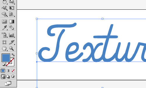
Since you want to use this concept on posters and flyers, let’s start with a large Artboard in Illustrator. Open a new file and make the width 17 inches by 5 inches. This ensures your final design is fairly close to the file size we will be working with now.

Step 2 – Type Setup
Using a font size of 250pt and our font from the resources above, type on your Art board.

Here’s where your own brand’s colors come into play. I’ll be using a blue color #4982c3 for this tutorial.
Go to Effects -> 3D -> Extrude & Bevel and use the following settings:

Step 3 – Text Layers
At this point it’s going to be very important to stay organized as you’re going to be moving layers around quite a bit. Duplicate the 3D layer. Name the original “3d text” so you can find it later.

With the layer copy selected, go to Object -> Expand Appearance. Expand the layer and select only the faces of the type. This can take awhile as you will have to sort through the groups until you find and Shift-Click to select each.

Go to Edit -> Cut and create a new layer. Go back to Edit -> Paste in Place.
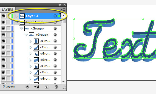
Delete the “Layer 1 Copy” as we will not need the shapes in that layer anymore. Rename “Layer 3” to “white.” You should only have two layers at this point.
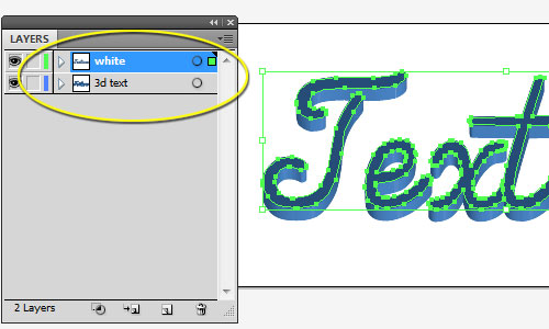
With the white layer selected, change the foreground color to white and add a 3pt white stroke.

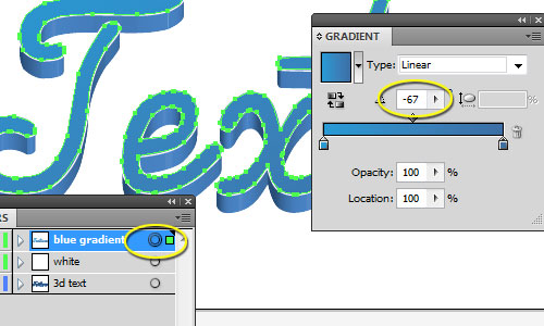
Duplicate the white layer and rename it “blue gradient.” Remove the stroke.

With the blue gradient layer selected, open the Gradient palette (Window -> Gradient). Use the settings as shown in the image below. The light blue is #2a99d4 and the dark blue is #3c6ea5.
[adsense]
Step 4 – Shadows
Duplicate the white layer again and remove the stroke. Change the foreground color to black. Rename it to “shadow.” Move it to the bottom layer.

Go to Effects -> Blur -> Gaussian Blur and use the following settings:

Move the layer so that the lighting casts the shadow below the text layers.

Step 5 – Optional Details
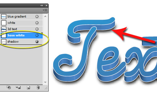
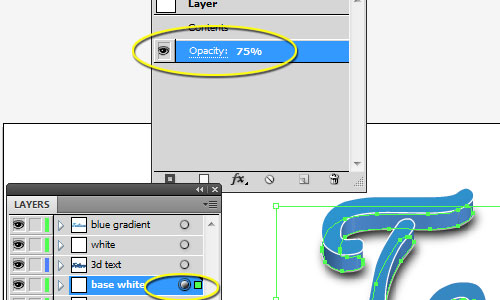
Optionally, if you want to make the base of the text pop a little more, duplicate the white layer (again) and remove the foreground color. Rename to “base white.”
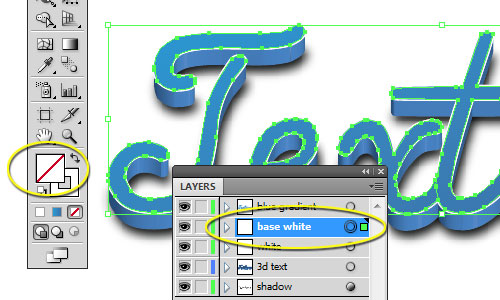
Move the base white layer to right above the shadow layer and move it to the bottom of the text.
If the effect is too much, simply use the Window -> Appearance palette to dial the opacity back to taste. I used 75%.
Step 6 – Background
At this point, your choice can vary wildly from what I’ll be using, but here’s a way to get a classy, clean look.
Create a new layer and move it to the bottom. Rename it “background.” Use the Rectangle Tool to draw a rectangle across the entire background. Use the foreground color #6B99C6.

With the background layer selected, go to Effects -> Stylize -> Inner Glow and use the following settings:

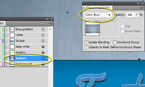
Step 7 – Texture
Now we get to the texture portion. Using the texture from the resources above, make a new layer above the background layer. Paste or place the texture in this layer. Rename the layer to “texture” and set the Blending Mode (Window -> Transparency) to Color Burn.
Duplicate the white layer once again. Move the layer to the top and rename it “text texture.”
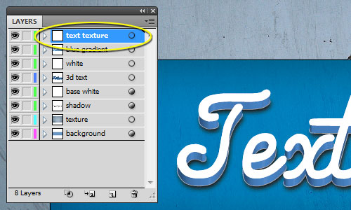
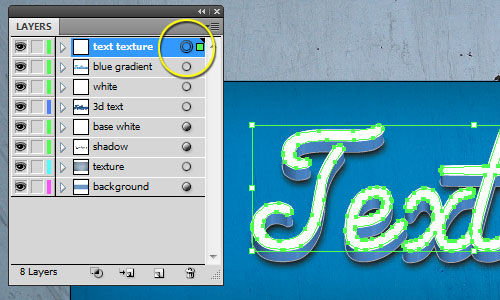
Select the path and go to Object -> Compound Path -> Make. If you get an error message, make sure you have actually clicked the small circle in the Layers palette.
Paste or place the Texture 2 image from the above resources and move the layer to immediately below the Compound Path layer in the text texture layer.
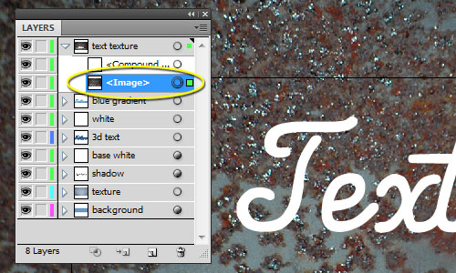
Select the text texture layer and click the Make/Release Clipping Mask button in the Layers palette.

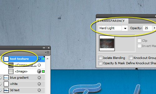
In the Transparency menu (Window -> Transparency), set the Blending Mode to Hard Light at 25%.
Final Results
Of course, you can tweak the various settings, use different textures, fonts, and colors. Here’s what we came up with as a final result.
